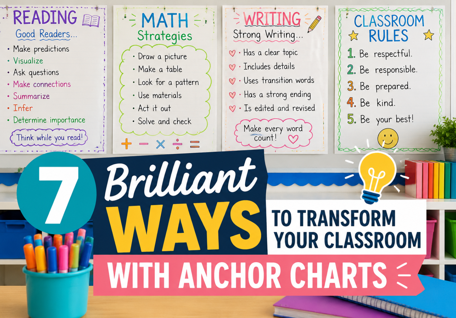
What Are Anchor Charts
Anchor charts are large, visual teaching tools that teachers create with students during lessons to capture key ideas, vocabulary, strategies, or steps. Think of them as a classroom’s living reference wall — something students helped build and can return to anytime they need a reminder. Unlike a poster you print and hang, these charts carry meaning because they were made together, in the moment, as part of real learning.
The beauty of anchor charts is that they don’t just sit there looking pretty. They anchor students’ thinking to a concept, giving the brain a visual hook to hang new information on. That’s not a metaphor, by the way — research on dual coding theory tells us that pairing words with visuals genuinely improves how well people remember information. These charts do exactly that, in a low-tech, high-impact way that works across grade levels and subjects.
Why Teachers Love Using Them
Walk into almost any K–8 classroom and you’ll spot anchor charts covering the walls in cheerful handwriting, color-coded bullet points, and simple drawings. There’s a reason for that. Teachers have seen firsthand that students who helped make a chart will glance at it during independent work instead of raising their hand every two minutes. That small shift in behavior — turning toward a resource instead of waiting for help — is a big deal for classroom independence.
What makes anchor charts so sticky for teachers is the flexibility. You can use them for reading strategies, math steps, writing skills, science vocabulary, social-emotional learning, classroom rules, and just about anything else. One teacher might use them to display sentence starters for academic discussion. Another uses them to track anchor charts for every grammar skill introduced throughout the year. The format bends to fit whatever your students need right now. For more on creating an environment where students take ownership, the classroom management strategies at knowledgeopedia.com offer some genuinely useful ideas.
How Anchor Charts Boost Retention
Here’s the thing about memory — it’s not a filing cabinet. Information doesn’t just slot neatly into folders and stay there. The brain needs repetition, connection, and context to hold onto new learning. Anchor charts work because they create a visual memory cue that gets reinforced every time a student glances at the wall. Over days and weeks, that repeated exposure does something real to retention.
Studies on visual learning suggest that about 65% of people are visual learners, and even those who aren’t benefit from pairing text with images. When a student reads a strategy off an anchor chart during a task, they’re not just re-reading words — they’re re-activating the memory of the lesson where that chart was made. That context matters. It pulls the concept back into working memory in a richer way than rereading a worksheet ever could.
There’s also something to be said for the physical presence of anchor charts in the room. Digital slides disappear when class ends. Notes in a notebook get buried. But a chart hanging right there in the reading corner or above the math station is a constant, low-effort reminder of what the class has learned together. That environmental consistency is underrated as a learning support.
Types of Anchor Charts That Work
Not all anchor charts are created equal. Some teachers make them too complex, cramming every possible piece of information onto one chart until it looks more like a ransom note than a reference tool. The most effective ones are clear, focused, and made with the students rather than for them. There are a few types that consistently get results.
Strategy charts break down a skill into steps — like how to write a strong paragraph or how to solve a word problem. Vocabulary charts define key terms with examples and pictures. Process charts show how something works, like the water cycle or the writing process. Reference charts list things students need to access regularly, like sight words or multiplication facts. And concept charts help students understand abstract ideas, like what a character’s motivation means or how to identify theme.
Choosing the right type depends on what your students actually struggle with. If they keep forgetting the steps to long division, a process chart posted near the math area will get more use than anything. If they’re writing flat sentences, a vocabulary chart full of strong verbs and descriptive words gives them something to reach for. The best anchor charts solve a real problem your students have right now.
Making Anchor Charts With Students
The co-creation part matters more than most teachers realize at first. When students watch a chart being built in real time — when their suggestions get written up on the paper — they feel ownership over it. That ownership translates to use. A student who contributed the phrase “look for context clues” to a reading strategy chart is way more likely to actually use context clues than one who received a pre-printed version of the same information.
The process doesn’t need to be slow or complicated. During a lesson, you pause, grab the marker, and say “let’s capture this.” You write down what students say, add a quick sketch or color-coded element, and keep going. The chart grows naturally from the lesson rather than being prepared in advance. This also means the language on the chart sounds like your students, which makes it more accessible than formally worded, adult-designed charts.
Some teachers pre-plan anchor charts as a rough draft, then recreate them with student input during the lesson. That’s a reasonable approach, especially for teachers who want things to look neat or need to manage time carefully. Just make sure students are still contributing language and ideas, not just watching you rewrite something you made the night before. The interaction is where the learning lives.
Anchor Charts for Reading Skills
Reading instruction is probably where anchor charts shine the brightest. Comprehension strategies, text structures, literary elements, vocabulary — these are all concepts that students need repeated exposure to and quick access to during reading time. A well-placed anchor chart on monitoring comprehension or identifying story elements can function like a silent co-teacher sitting beside every student.
For younger readers, anchor charts that display high-frequency words, phonics patterns, or decoding strategies are particularly powerful. A chart showing the difference between a short vowel and long vowel sound, with picture examples students know, becomes a tool kids actually use when they get stuck. For older students, charts that break down inference or summarizing into concrete steps help during independent work when you can’t be next to every student at once.
One approach that works well is building a series of anchor charts across a unit, then keeping them all visible so students can see how the concepts connect. By the end of a reading unit on determining theme, students might have charts on character motivation, central message, and evidence from the text — and they can see how those ideas layer together. That kind of visual progression supports deep comprehension in a way that’s hard to replicate otherwise.
Using Anchor Charts in Math Class
Math teachers sometimes overlook anchor charts, maybe because the subject feels more procedural and less discussion-based. But that’s actually exactly why anchor charts work so well in math — procedures need to be visible and accessible, not just explained once and then expected to live in students’ heads forever. According to the National Council of Teachers of Mathematics, visual representations are a core component of effective math instruction across all grade levels.
A multiplication strategies chart, a place value reference, a list of geometric formulas, a breakdown of the order of operations with examples — these are the kinds of math anchor charts that students genuinely reach for during problem-solving. The key is making sure the chart shows the thinking, not just the answer. A chart that shows how to set up a proportion step by step, with a worked example, is infinitely more useful than one that just says “cross-multiply.”
Math anchor charts also help with math vocabulary, which trips a lot of students up. Words like “product,” “quotient,” “factor,” and “sum” are easily confused, especially for English language learners. A chart that pairs each term with a simple example and a visual representation takes about ten minutes to make and saves countless interruptions throughout the year. It’s one of those small investments that pays dividends every single day.
Anchor Charts for Writing Instruction
Writing is hard to teach partly because so much of it is invisible — it happens inside a writer’s head before it ever makes it to the page. Anchor charts make that invisible thinking visible. They give students a window into the choices writers make, the questions they ask themselves, and the strategies they use when they get stuck. That visibility is enormously helpful for developing writers.
A chart on leads and hooks can show five different types of openings with one example of each. Students can look at it before they start a draft and choose the type that fits their piece. A revision chart might list specific questions a writer asks about their own work — “Does my lead pull the reader in? Did I vary my sentence length? Are there any dead words I can cut?” That kind of self-questioning builds the metacognitive skills that separate developing writers from strong ones.
Writing anchor charts also work well as a record of class discussions and mentor text analysis. When you and your students read a great piece of writing together and pull out the techniques the author used, capturing that on a chart extends the learning far beyond the day of the lesson. Students can refer back to it weeks later when they’re working on a similar type of writing and think, “Oh right, we noticed that the author varied sentence length to create pace.” That’s exactly what anchor charts are designed to do.
Keeping Anchor Charts Organized
One challenge every teacher faces is managing the sheer volume of anchor charts that accumulate over a school year. By December, you might have thirty or forty charts and not enough wall space to display them all. That’s when systems become important. Some teachers rotate charts based on the current unit, storing old ones rolled up and labeled. Others photograph each chart and compile them into a digital notebook students can access.
A popular approach is creating a class “chart museum” — a dedicated area, maybe a rolling rack or a large binder with full-page photos of each chart, where students can browse archived charts. This keeps the most relevant current charts visible while preserving everything else for reference. Some teachers even make mini versions of key charts for student notebooks, so the reference travels with the student instead of staying on the wall.
Labeling matters too. A chart with no title or date is hard to find later. Getting into the habit of writing the skill, subject, and approximate date on each chart makes retrieval much easier. It also helps students understand the purpose of each chart, especially when there are many up at once.
Common Mistakes to Avoid
The most common mistake is making anchor charts without students. A beautifully designed, pre-made chart stapled to the wall before students arrive might look amazing, but it doesn’t carry the same weight as one the class built together. Students don’t have a memory attached to it, so they’re less likely to notice it, use it, or remember what it means.
Overcrowding is another frequent issue. When a chart tries to cover too much, students don’t know where to look, and the main idea gets lost. One concept per chart is almost always better than trying to fit everything in. A cluttered chart is like a cluttered desk — technically it has everything you need, but finding anything feels more trouble than it’s worth.
Finally, making charts and then ignoring them is a waste of everyone’s effort. If you never refer back to an anchor chart after the lesson it came from, students won’t either. Make a habit of pointing to relevant charts during lessons, prompting students to consult them before asking for help, and celebrating when you catch someone using one independently. The chart is only as useful as the culture around using it.
Digital Anchor Charts in Modern Classrooms
Technology has opened up some genuinely interesting possibilities for anchor charts. Apps like Jamboard, Nearpod, and Padlet allow teachers to create digital versions that students can access on their devices, contribute to in real time, or revisit at home. For hybrid or remote learning situations, digital anchor charts are an obvious solution to the wall-space problem.
That said, there’s something about a physical chart in the room that a digital version can’t fully replicate. The presence, the scale, the fact that it’s literally hanging in front of you during a lesson — these things affect attention in ways that a thumbnail on a screen doesn’t. Many teachers use both: a physical chart built during class and a photographed version uploaded to the class digital platform for at-home access.
If you do go digital, the same principles apply. Keep it focused, make it with students, refer to it often, and make sure it solves a real learning problem. The medium is secondary to the purpose.
Anchor Charts Across Grade Levels
One thing that surprises teachers new to anchor charts is how well they work across a much wider age range than expected. High school teachers sometimes assume anchor charts are a primary grades thing, but a well-made chart on argumentative essay structure or AP vocabulary terms is just as useful for a 16-year-old as a phonics chart is for a 6-year-old.
The format and complexity shift with age. Charts for young learners lean heavily on visuals, large text, and simple vocabulary. Charts for middle and high school students can include more detail, more nuanced examples, and more student-generated language. The core purpose — making learning visible, accessible, and reference-able — stays the same no matter what grade you teach.
Secondary teachers often find that anchor charts help English language learners and students with learning differences in ways that other instructional materials don’t. When content is visible on the wall, in clear language, with visual support, it removes barriers that might otherwise prevent a student from accessing the curriculum.
Student Engagement Through Chart Making
There’s an engagement piece to anchor chart creation that’s worth talking about. The moment a teacher says “let’s make a chart about this,” students often perk up. There’s something about the act of capturing ideas on large paper — the big marker, the colorful additions, the sense that this is important enough to record — that gets students invested.
Some teachers take this further by giving students real roles in chart creation. One student might be the recorder, writing the class’s ideas on the chart. Others might add illustrations or examples. Students might each contribute one piece of language for a vocabulary chart. This participatory approach turns chart-making into a collaborative academic ritual that students look forward to.
Student-created anchor charts — where small groups or individual students make their own versions — are another powerful option. After a lesson, students create their own chart summarizing what they learned. This synthesis activity is deeply effective for retention and gives the teacher a useful formative assessment tool at the same time.
Anchor Charts and Differentiation
One of the quieter benefits of anchor charts is how naturally they support differentiated instruction. A student who struggles to process verbal instructions can glance at a chart and get the same information in a visual, accessible format. A student who finishes early can extend their thinking using a chart that offers examples of more complex applications. An English language learner can use picture support on a vocabulary chart to access content they might otherwise miss.
Anchor charts also allow teachers to differentiate the creation process without it feeling like differentiation. During chart-making, a teacher can call on students at different levels to contribute different parts — a student who needs support might label a simple example, while a student who needs challenge might articulate the underlying rule. Everyone contributed, everyone is represented, and the chart reflects the range of the class.
For students with IEPs or 504 plans, anchor charts often appear as an approved accommodation — “access to visual references.” In those cases, having a rich library of charts is both a legal support and a genuinely helpful one. It’s rare to find something that serves compliance and instruction equally well.
FAQ
What are anchor charts used for in the classroom?
Anchor charts are used to capture key ideas, strategies, vocabulary, or steps during a lesson so students have a visual reference to consult throughout the unit. They support recall, independence, and comprehension across all subjects and grade levels.
How often should anchor charts be updated or replaced?
There’s no fixed rule, but a good guideline is to keep charts visible as long as students are actively working with the related concept. Once a unit wraps up, store the chart and rotate in the next one. Some foundational charts — like a writing conventions chart — might stay up all year.
Do anchor charts work for older students in middle or high school?
Absolutely. Older students benefit from visual references just as much as younger ones, though the complexity and format shift accordingly. Charts on essay structure, literary analysis strategies, or discipline-specific vocabulary are highly effective for secondary learners.
Can anchor charts support English language learners specifically?
Yes, and this is one of their strongest use cases. Anchor charts that pair text with visuals, use simple clear language, and are displayed consistently give English language learners a low-barrier way to access content and academic vocabulary. They’re a flexible, inclusive tool for any linguistically diverse classroom.
Why Anchor Charts Still Matter
After decades in classrooms around the world, anchor charts remain one of the most reliable instructional tools a teacher can use. They’re not trendy, they don’t require a subscription, and they can’t crash. They work because learning is social, visual, and contextual — and anchor charts hit all three.
The classrooms where anchor charts do the most are the ones where they’re treated as living documents, not decorations. They’re made with students, referred to constantly, updated when understanding deepens, and celebrated when students use them independently. In those rooms, the walls aren’t just covered — they’re working.
If you haven’t experimented much with anchor charts yet, start small. Pick one upcoming lesson, grab some chart paper and a marker, and build something with your students. Watch what happens when they look at the wall during independent work. Chances are, you’ll be hooked. And if you’ve been using anchor charts for years, consider whether your current approach is getting the most out of them — because the gap between a chart that decorates and a chart that teaches is worth closing.